On pack aesthetics are big driver for sales of healthy snack bars

White and green colours were found to be most commonly associated with health, whilst nutritional information labels were only acknowledge in the absence of other packaging design traits.
However price and flavour choices were the biggest deciding factors for consumers when purchasing snack bars.
Aesthetics or nutrition?
Researchers from Brazil evaluated packaging design attributes on snack bars and asked consumers to comment on them.
In focus groups, consumers were asked to choose the most important factors of the packaging that would influence their decision to purchase the snack bar or not.
Six commercial brands of snack bars were also evaluated by a larger group of consumers in a three-session test: the first, with no information about the product, the second with only the product packaging and the third with the information on the health-related claims.
The team found that packaging design played a large role when persuading consumers to purchase the product, especially colours and flavour descriptions.
Not only can packaging attributes affect the consumers’ buying habits but also how they actually taste the product.
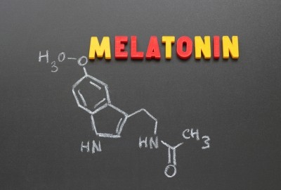
In the introduction, the team commented that a previous study reported that milk containing information about the high concentration of melatonin and its health benefits had higher sensory acceptance compared to a blind test.
The aesthetics of the products were found to be very effective as the team, led by Josefina Bressan, found that some consumers would not purchase a product based on its health claims alone.
A green ‘female body’ or a leaf appearing o the packaging were found to be most commonly associated with health, as well as the words ‘lightness’ and ‘health’ appearing in the brand name.
The participants in the study criticized the placement of nutrition information on the packaging, noting that it was mainly on the back of the bar and sometimes even under the seam.
The consumers said that information on nutrient contents, health benefits and risks should be displayed clearly on the front of the packaging.
However, the research team commented that putting all nutrition information on the front of packaging could be confusing to consumers, and so instead the study showed that only the most important information regarding health claims and nutrition should be displayed on the front, in a clear and accessible way.
Furthermore, the study reports that ‘high omega-3 content’ and ‘no additives’ claims are the most likely to drive sales.
Flavour is key
During tasting, the researchers found that flavour is one of the most important deciding factors when consumers are choosing a snack bar.
Perhaps unsurprisingly chocolate was the most preferred flavour of snack bar in the study, whilst participants found protein bars to be bitter and have a “very bad taste”, due to the soy protein in them.
The study authors commented that this sort of bad experience could stop consumers from repeat buying a product.
Moreover, it was found that health-related claims and other non-sensorial factors of the package exceeded the taste, which means consumer distrust of expectations could be generated.
Texture was found to be as important as taste.
Source: Food Research International
Published online, DOI: 10.1016/j.foodres.2017.08.062
‘Influence of package and health-related claims on perception and sensory acceptability of snack bars’
Authors: Josefina Bressan, et al.